
TL;DR
Table of Contents
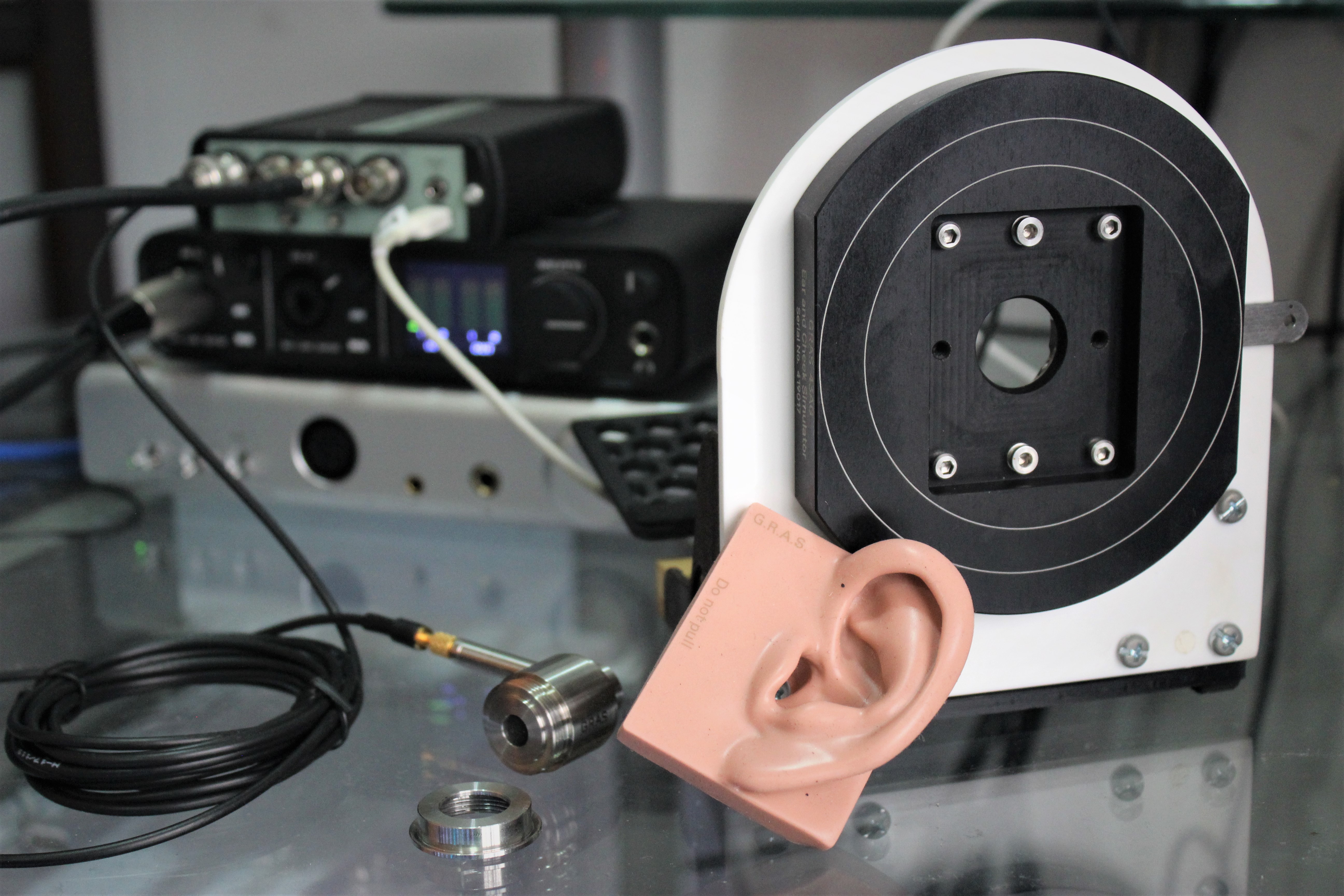
The GRAS 43AG-7, responsible for headphone measurements database
This is an article that many have been asking for, given that I’ve become one of the primary sources of frequency response measurements these days. Most of the concepts that are being talked about have been simplified so as to be better understood by newbies in the hobby, so some explanations and terminologies may not be the same as the ones being used by seasoned veterans of the hobby.
This guide has been formatted in order of increasing complexity, so you’re free to stop whenever you think things get too crazy. Though, I encourage all newbies to at least sit through the first five topics.
The Basics
Alternate text: Graph-reading for dummies
I don’t want to go too far into the true basics since that entails a physics lesson on sound and sine-waves. Instead, I’m just going to assume that you already know what the term “frequency” is, and if not, refer to the the video below.
That is what’s called a sine sweep (or frequency sweep), where a tone of increasing frequency is played at equal volume throughout. Did you realise that some frequencies could be louder or softer than others? This is despite the fact that, digitally, each frequency is played back at the same volume to one another. That’s what a frequency response measurement captures: the relative loudness between each frequency point, played by your headphone (or IEM).
When you plot these points on a graph from 20Hz and 20,000Hz (the range of human hearing), a frequency response measurement becomes a line on said graph. The y-axis represents volume, while the x-axis represents the frequency.
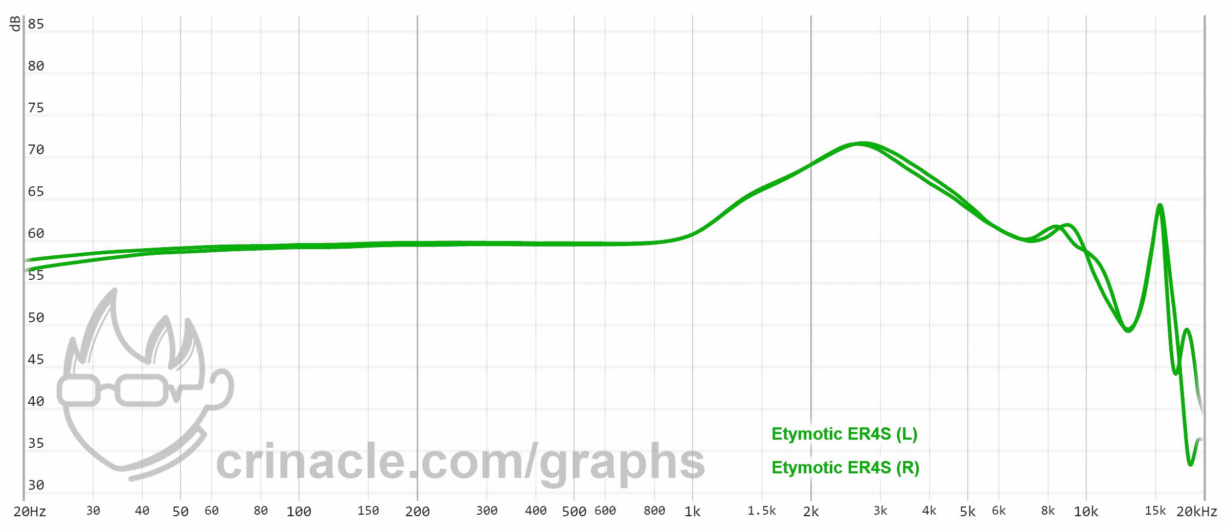
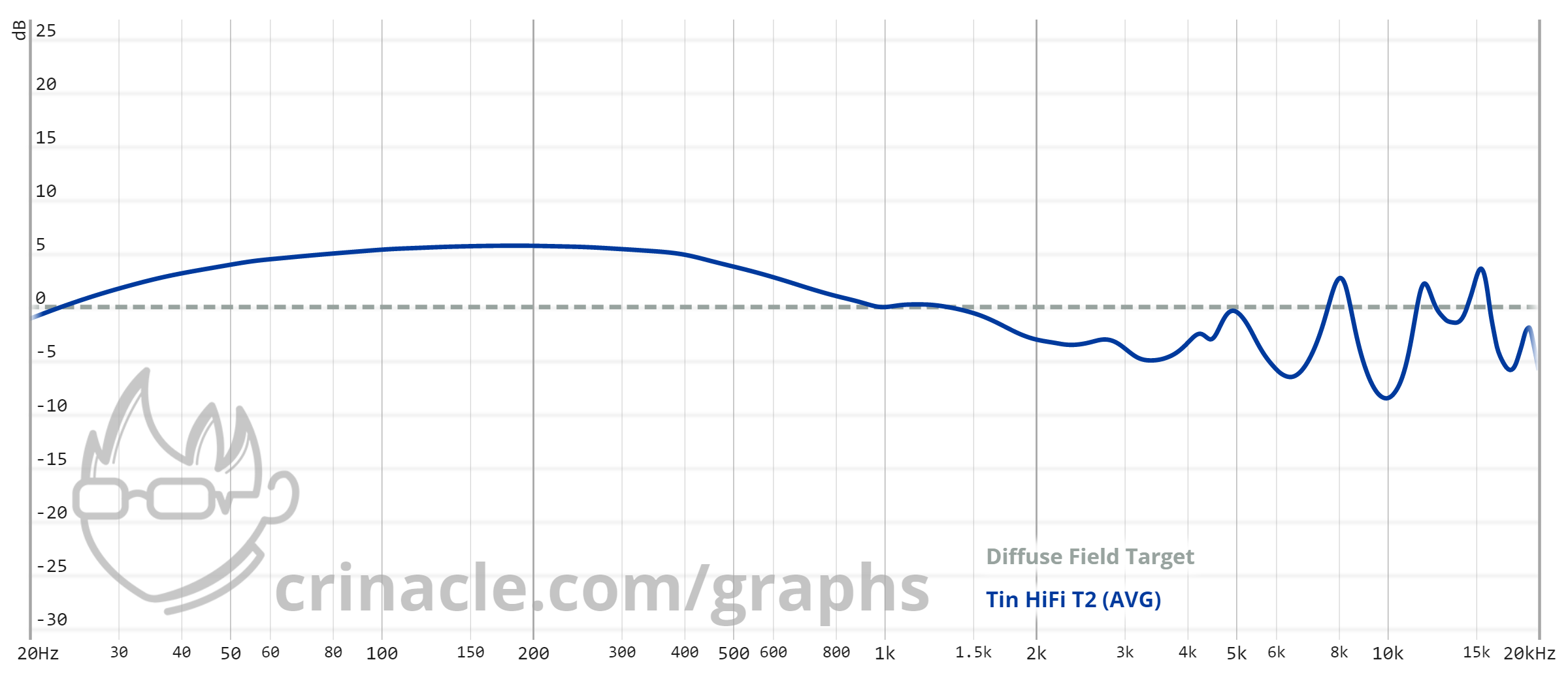
If we’re analysing this graph as it is, the following characteristics can be seen:
- Fairly linear response below 1kHz, with a mild roll-off below 100Hz
- “Roll-off” refers to a decrease in volume as you move up or down the frequency range
- Peaks around 2.6kHz at a volume of roughly 12dB
- Rolls off past its initial peak, bottoming out at 7kHz where it’s roughly in line with its response at 1kHz
- Dip of roughly 10dB at 12kHz
- Peak at about 16kHz
- Roll-off past 16kHz
And if you’re taking this data at face value, you’d say that the Etymotic ER4S is “flat” in the bass with a boosted upper midrange, and back to somewhat “flat” treble. This assessment is not the most accurate since the data I’ve provided in the graph is “raw”, but more on that in the next topic.
“Bass”? “Upper midrange”? For some of you, those might be familiar words that you’ve seen but not wholly understood. Such words are descriptors intended to refer to a general range of frequencies, an alternative to having to specify the exact range of numbers every single time.
You may have seen this famous frequency chart from the now-defunct Independent Recording Network:
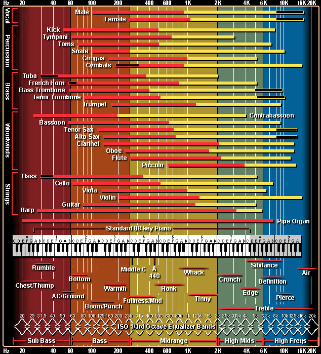
Which probably provides a better explanation than anything I can conjure up at the moment. Though for clarity’s sake, I’ll write down my personal classifications of each frequency range:
- 20Hz to 80Hz: Sub-bass
- 80Hz to 200Hz: Mid-bass
- 200Hz to 800Hz: Lower midrange
- 800Hz to 1,500Hz: Centre midrange
- 1,500Hz to 5,000Hz: Upper midrange
- 5,000Hz to 10,000Hz: Treble
- 10,000Hz+: Upper treble/”air”
Why is this distinction important? For starters, knowing what my definitions of each frequency range are helps to interpret reviews, especially for reviewers like me who often makes references to frequency response. Everyone has their own personal definitions and there are no strict set of rules that dictate where each frequency range ends and where another begins.
A different person might say that the term “upper mids” only refers to frequencies between 2kHz and 4kHz. Perhaps another would say that “upper bass” is a region that needs to be acknowledged and distinguished from the rest. Even the chart above disagrees with my classification and sees no need to specifically highlight “low mids” as its own frequency range, but that’s fine. As long as you’re aware of what I’m referring to whenever I use these terms, that’s the ultimate goal of using such descriptors.
You can make use of a FR graph to see whether or not your desired frequency range is boosted or dipped. Perhaps you’re a basshead, so a roll-off below 400Hz would be a huge red flag for you. The purpose of a FR graph is to allow you to objectively see the “signature” of a given headphone or IEM, and so is a vital (basically essential) part of your purchasing decisions as an audiophile, especially when you don’t have immediate physical access to said product.
Scaling & Smoothing
Tricks of the trade
With the increasing popularity of frequency response measurements, many companies had turned to publishing their own graphs for extra marketing power. But this also means that the data is prone to manipulation by said company in order to make a not-so-great measurement look a little better. This is done primarily in four ways:
- Increased scaling
- Increased aspect ratio
- Increased smoothing
- Usually denoted as “1/X octave smoothing” where the lower the value of X, the greater the smoothing.
- Insert depth and resonance manipulation (explained further in the “Coupler Resonance” topic)
The first two comprise a technique I’d refer to as the ol’ “stretch and squash”; “squashing” the curve by “stretching” the y-axis and aspect ratio. Combine these with boosted smoothing to flatten those peaks and dips, and what you got is a beautified graph that few would take issue on.
Let’s use the Empire Ears Valkyrie as an example, an IEM with huge imbalances in the bass, mids and treble:
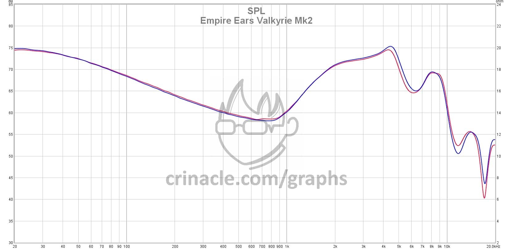
This graph is my standard format, done on a 30dB to 85dB y-axis (55dB differential), 16:9-ish aspect ratio and a reasonable 1/12 octave smoothing. Now watch what happens when I stretch the y-axis, stretch the aspect ratio and turn the octave smoothing all the way up to 1/3:
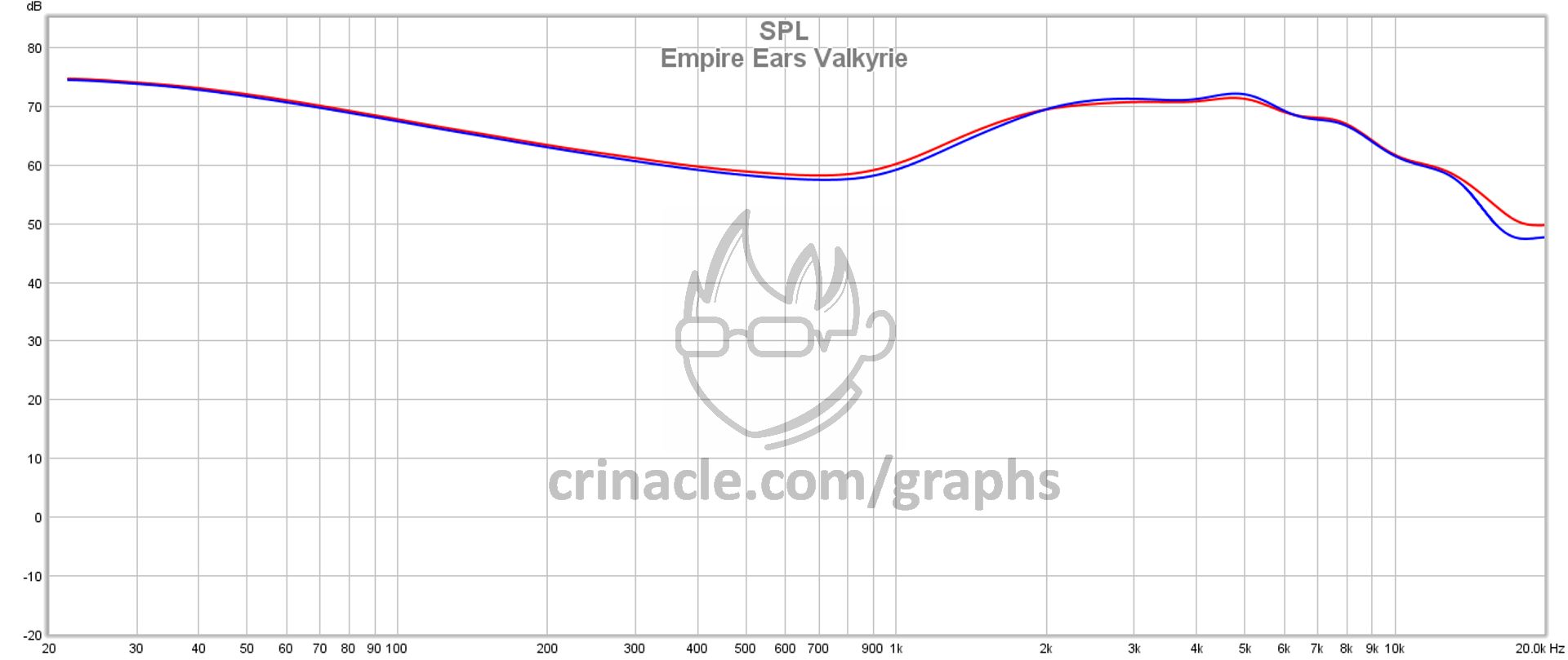
Would you look at that, the curve has been thoroughly squashed. Now it looks only slightly V-shaped as opposed to the extreme-V it was previously.
It’s always important to look out for these things when analysing a graph. The data itself may not be touched, but sometimes it’s the presentation of said data that fools people the best. So whenever you look at a graph from an unknown source, it’s good to ask yourself these questions:
- What is the y-axis range?
- What is the aspect ratio of the graph?
- 50dB is my personal sweet spot on a roughly 16:9 aspect ratio.
- A larger y-axis range with a higher aspect ratio is a red flag for a beautified, “squashed” curve.
- Did the graph state the octave smoothing used? If not, does the measurement look unnaturally smooth or suspiciously lacking in peaks and/or dips?
- It’s always good to ask the graph provider, whenever possible.
Normalisation
Things are not as they seem
The term “normalisation” is relevant when comparing graphs. Basically, a normalisation point is the point where you’d like two (or more) graphs to match themselves at, allowing for easier reading of graphs.
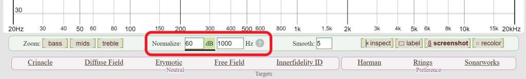
The normalisation function in the Graph Comparison Tool
My graph comparison tool allows you to either normalise by perceived volume (equal loudness) or at a frequency point. Normalisation can also affect how you read an interpret a graph, so it is important to know what it is, and how to use it.
As a demonstration, I’ll just select two random IEMs to compare:
The normalisation above defaults to “equal loudness”, so these are the differences you’d reasonably expect to hear if you were to volume-match these two IEMs by ear.
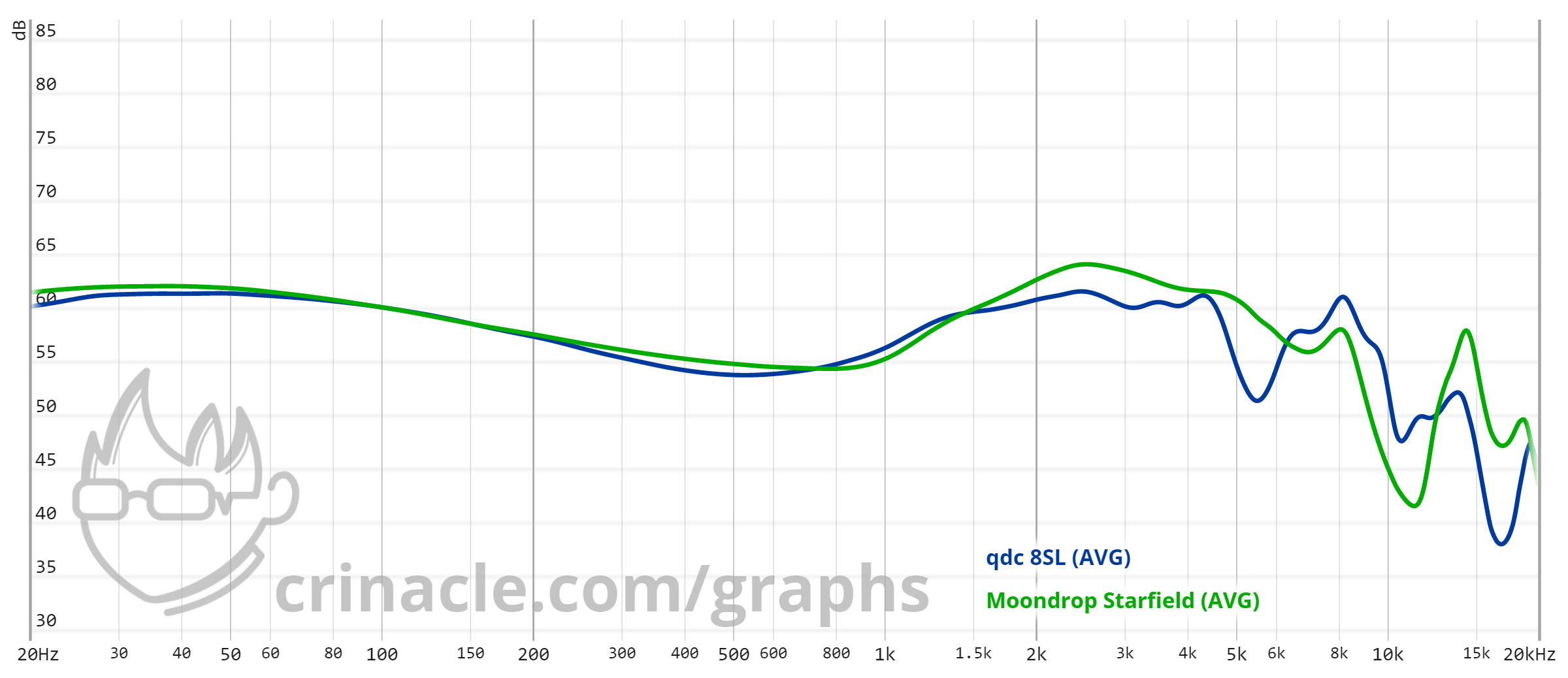
However, there seems to be a “rule of thumb” floating around that states that normalisation should always be done at 1kHz. I think that’s a decent general guideline in the absence of equal-loudness contouring, but watch what happens when I normalise these two graphs at 1k:

Looks a little weird. Now the Starfield is louder from 20Hz all the way up to 7kHz. Not quite a fair comparison, is it?
And the comparison gets worse if you were to compare a neutral set of IEMs with something that’s very V-shaped:
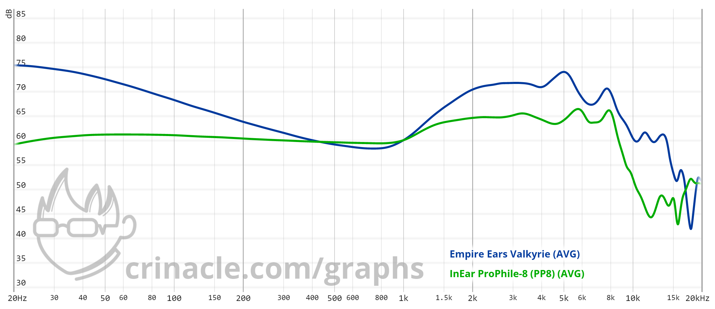
Again, I’m not saying that normalising at 1kHz is a bad thing to do, since a lot of IEMs tend to compare well at that particular point. However, it’s not a set-in-stone rule that has to be followed all the time. The name of the game is knowing what exactly you’re trying to compare; for instance with IEMs with a lot of different individual tunings:
Normalising by equal loudness or even at 1kHz doesn’t seem to put the point across very well. It’s not bad, but not the most optimal presentation of the differences. But given that the bass response seems to be the same in every instance, let’s see what happens when we normalise at an unorthodox 200Hz:
Much better, and the differences in each setting are shown much more clearly by locking the lower frequencies as a constant.
So again, there’s no hard-and-fast rule when it comes to normalisation. A lot of it comes down to knowing the comparison you want and gut feel. But for the most part, keeping the default to equal loudness would be the best choice for a newbie.
What are "raw graphs"?
TL;DR: Flat on a raw graph is not flat in real life
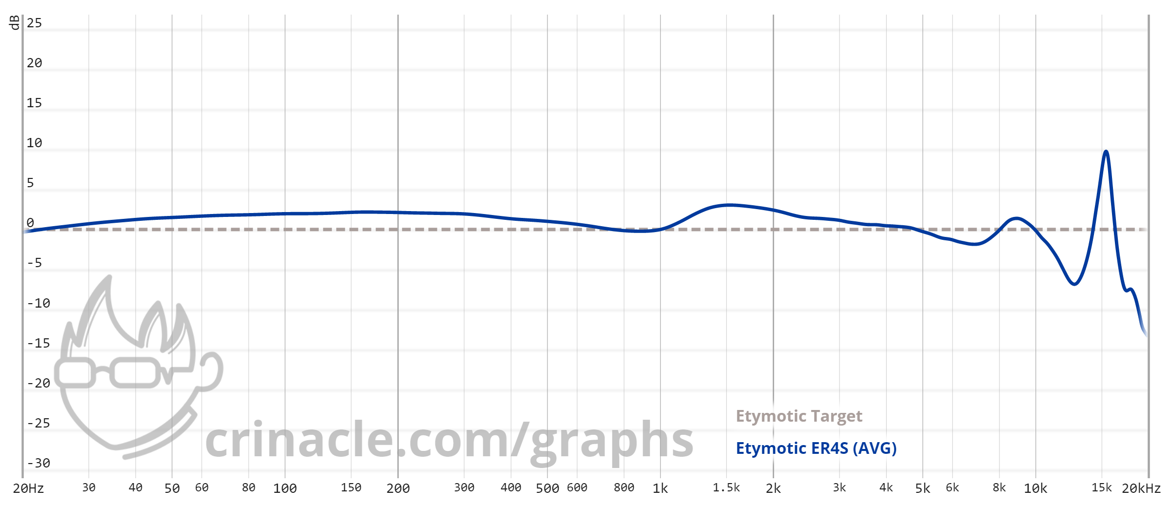
Now we’re getting into the good stuff. I’ve mentioned in the first topic that my assessment of the ER4S graph is not the most accurate since the data is “raw”. What exactly does that mean?
“Raw” is a term that I use often since the graphs and measurements that I publish are typically displayed as such, and its meaning is pretty self-explanatory. “Raw graphs” (or measurements) typically refer to measurements that have not been altered, usually to signify that said graph has not been “compensated” (next topic).
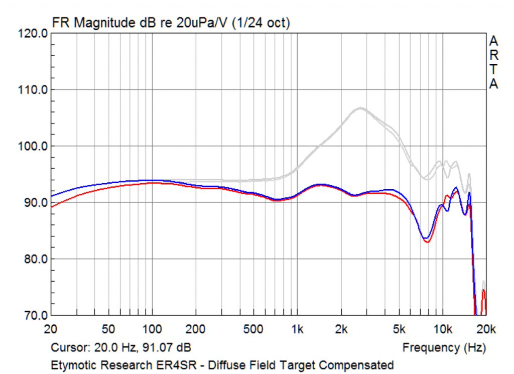
Graphs from sources like HeavyMetal Hallelujah typically compensate to Diffuse Field (red and blue lines) but also show the raw measurements (grey).
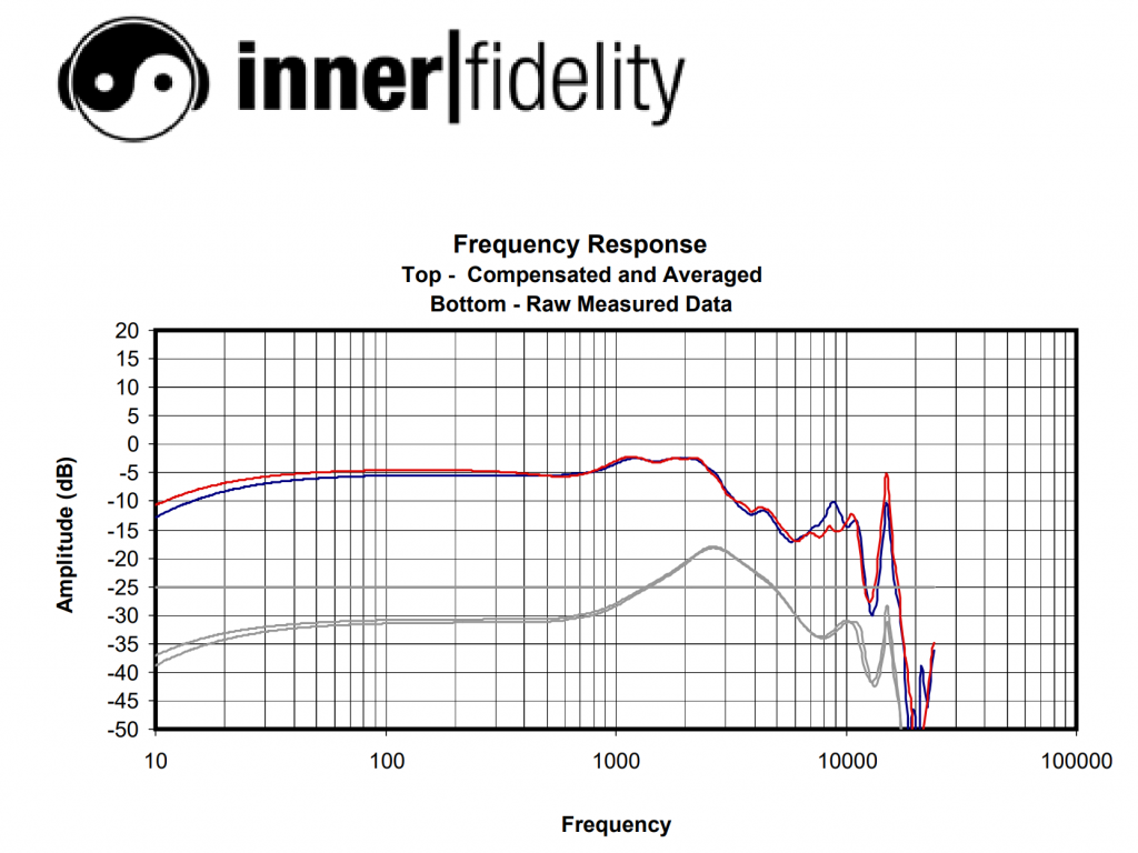
Innerfidelity holds the same practices, with their proprietary Independent-of-Direction (ID) compensated graph in red & blue, while simultaneously displaying the raw measurement below that in grey. (This is also a measurement of the Etymotic ER4SR.)
You can see that in both cases, while Innerfidelity and HeavyMetal Hallelujah use the same industry-standard couplers (more on that in the “Measuring Systems” topic), their compensated (red & blue) graphs are wildly different. This is due to the different compensations used, which we’ll get into in the next topic. For now, take note that while the compensated graphs are different, the raw graphs are largely similar if not identical.
Why is this significant? In the case of IEM and headphone measurements, flat on a raw graph does not mean that the resulting sound is flat when you listen to it. The reasons are explained in the topic “Measuring Systems“, but for now your main takeaway should be that raw graphs (in the case of headphones and IEMs) should not be taken at face value.
So since a raw graph doesn’t tell you what “flat” is, how exactly would you properly read it?
Compensations
And the concept of "target curves"
A compensation is basically substracting a “target curve” from an existing measurement in order to get a new compensated graph. Basically, compensation turns a selected target curve into a flat line, with any peaks and dips representing deviations from said target.

Compensation makes graphs easier to read by making a flat line now actually mean something. So… why not make every graph compensated? Make it so that in every graph, flat = flat in real life?
The problem with that is… well, what is flat?
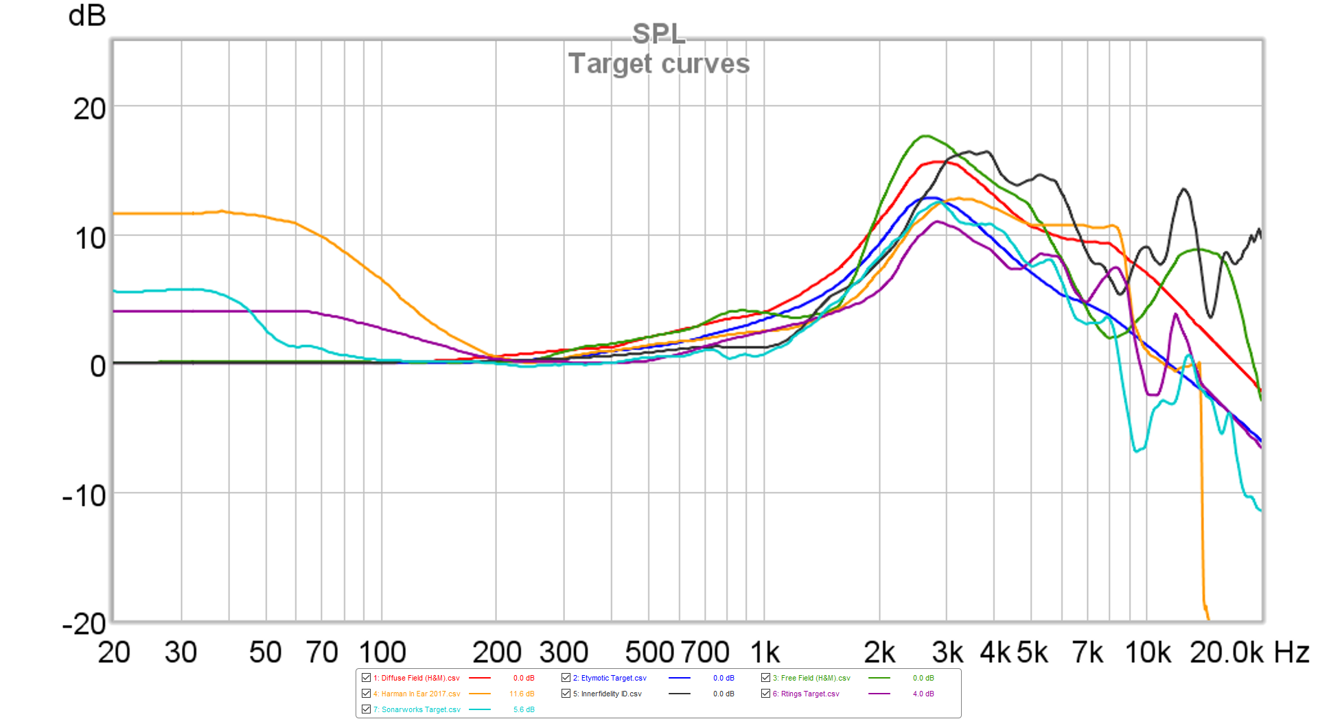
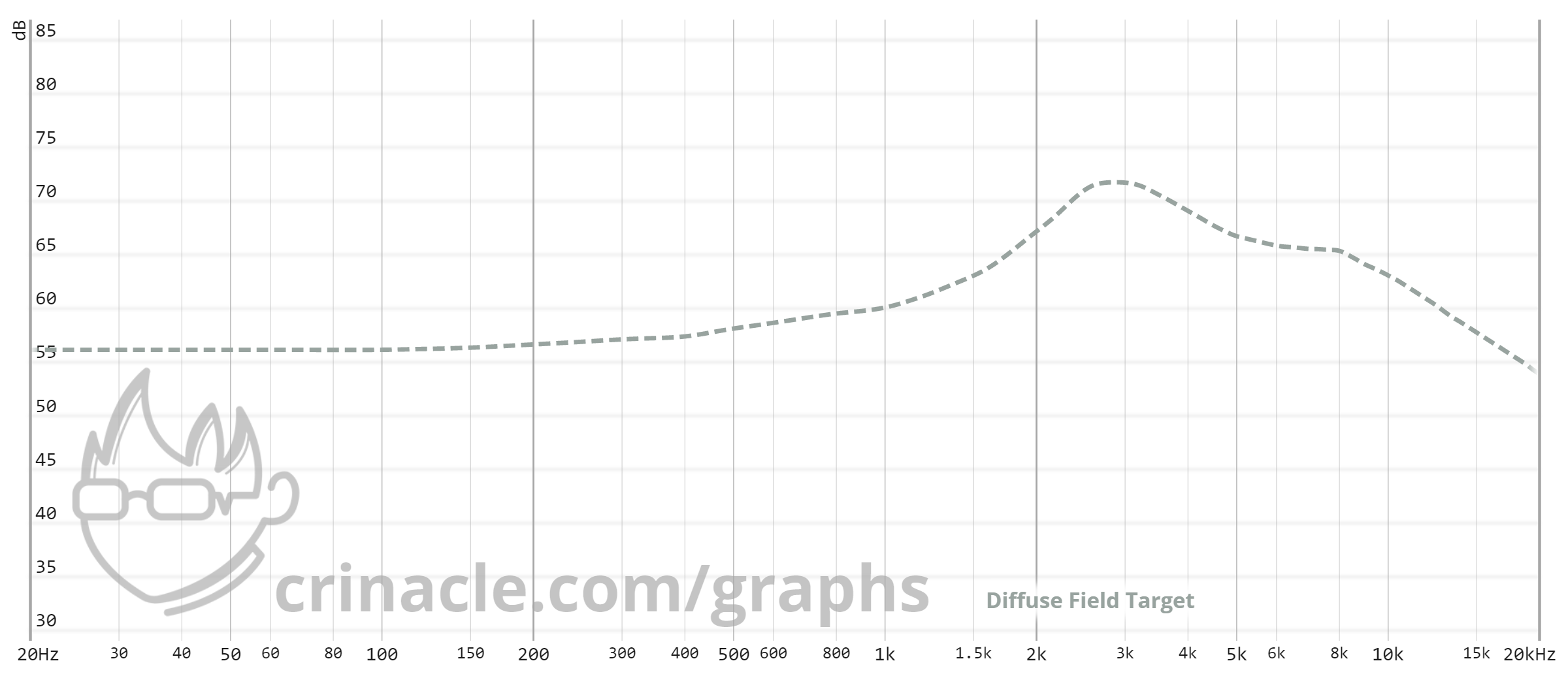
Most of the time, headphone (and sometimes IEM) measurements are compensated to the Diffuse Field curve. So that’s it then! you may cry, just compensate everything to Diffuse Field!
Yeah… uh, which Diffuse Field?
Alright, so the more seasoned of you veterans might be rolling your eyes now since most measurbators would’ve already considered the Hammershøi & Møller Diffuse Field response to be the “standard” DF target that most academics would default to. But the dilemma is still very much real here whenever someone mentions “compensation” in the context of headphone & IEM measurements; the mere fact that a graph is “compensated” is not enough, and specifying the target curve used is just as crucial.
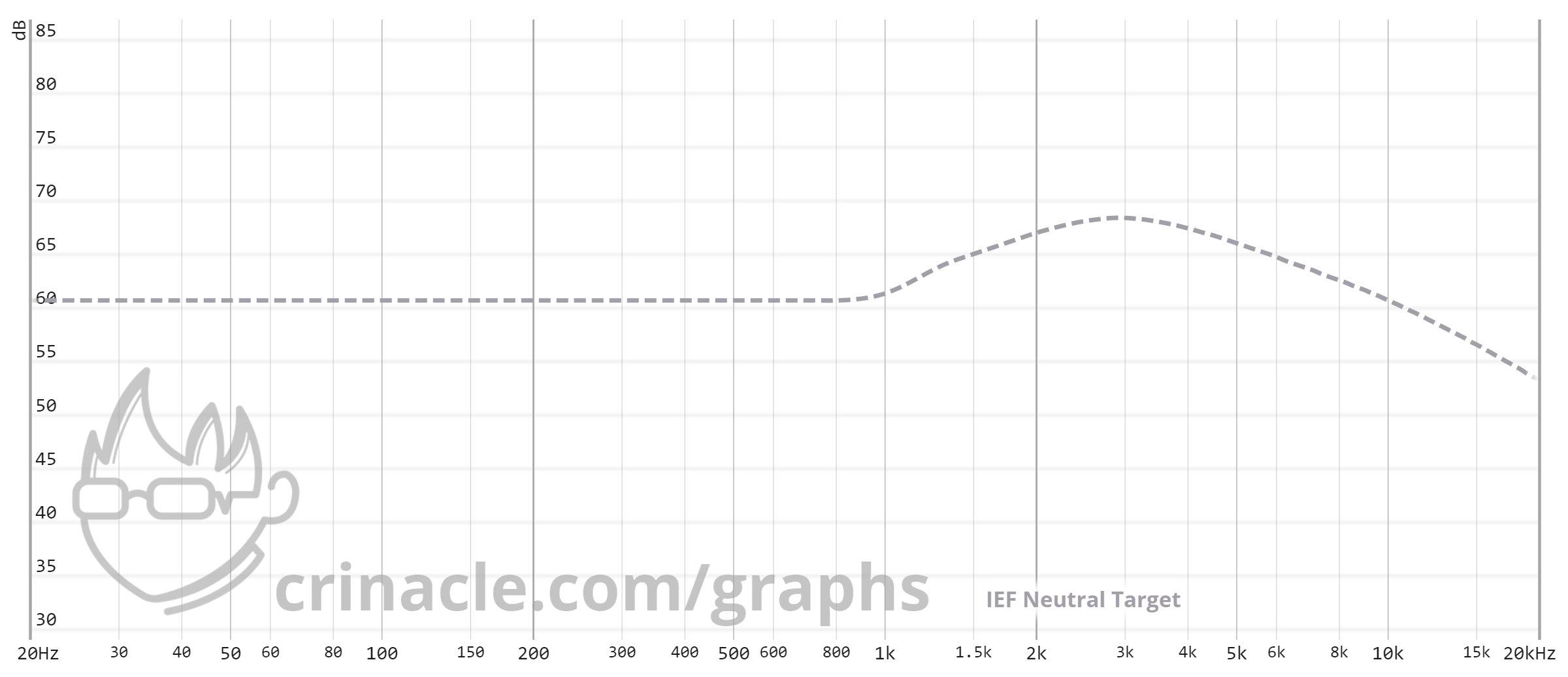
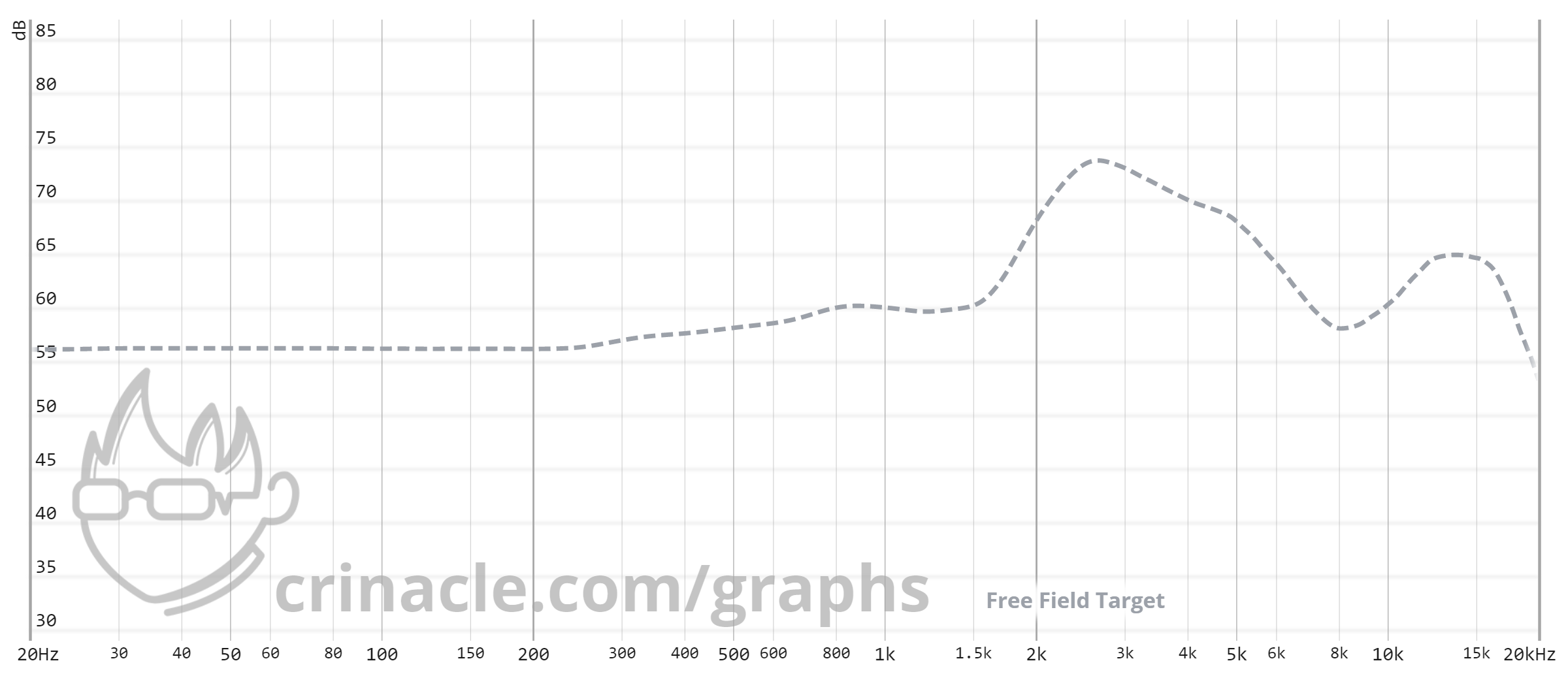
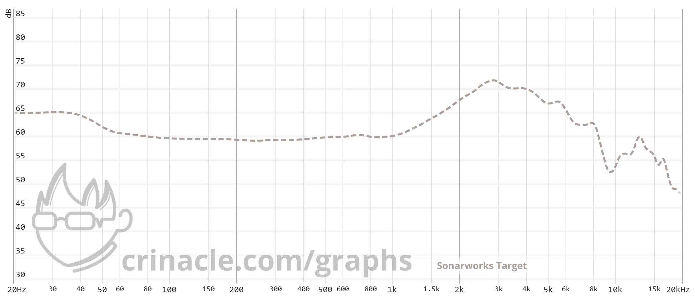
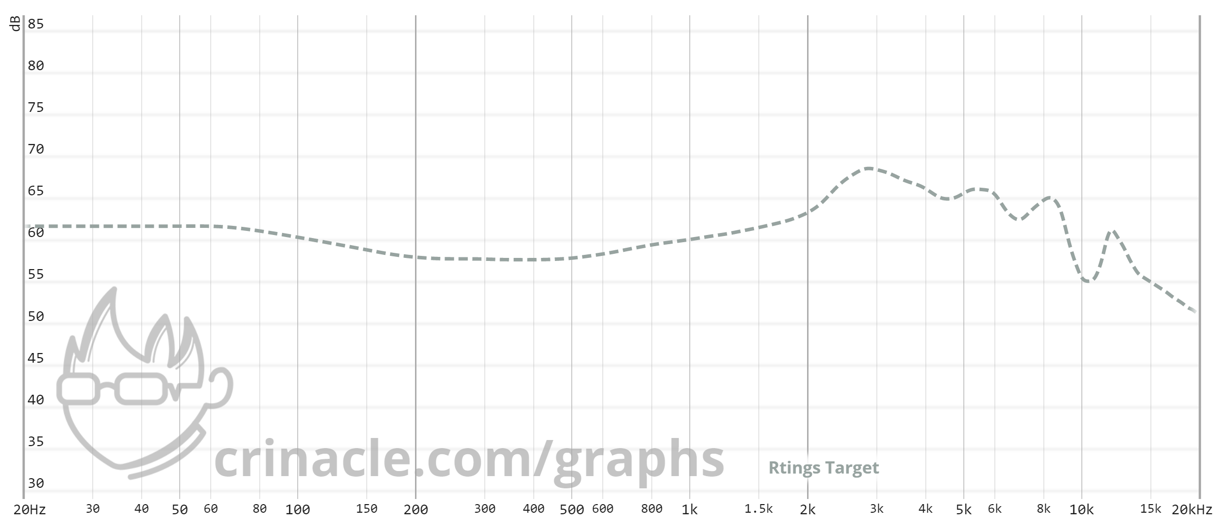
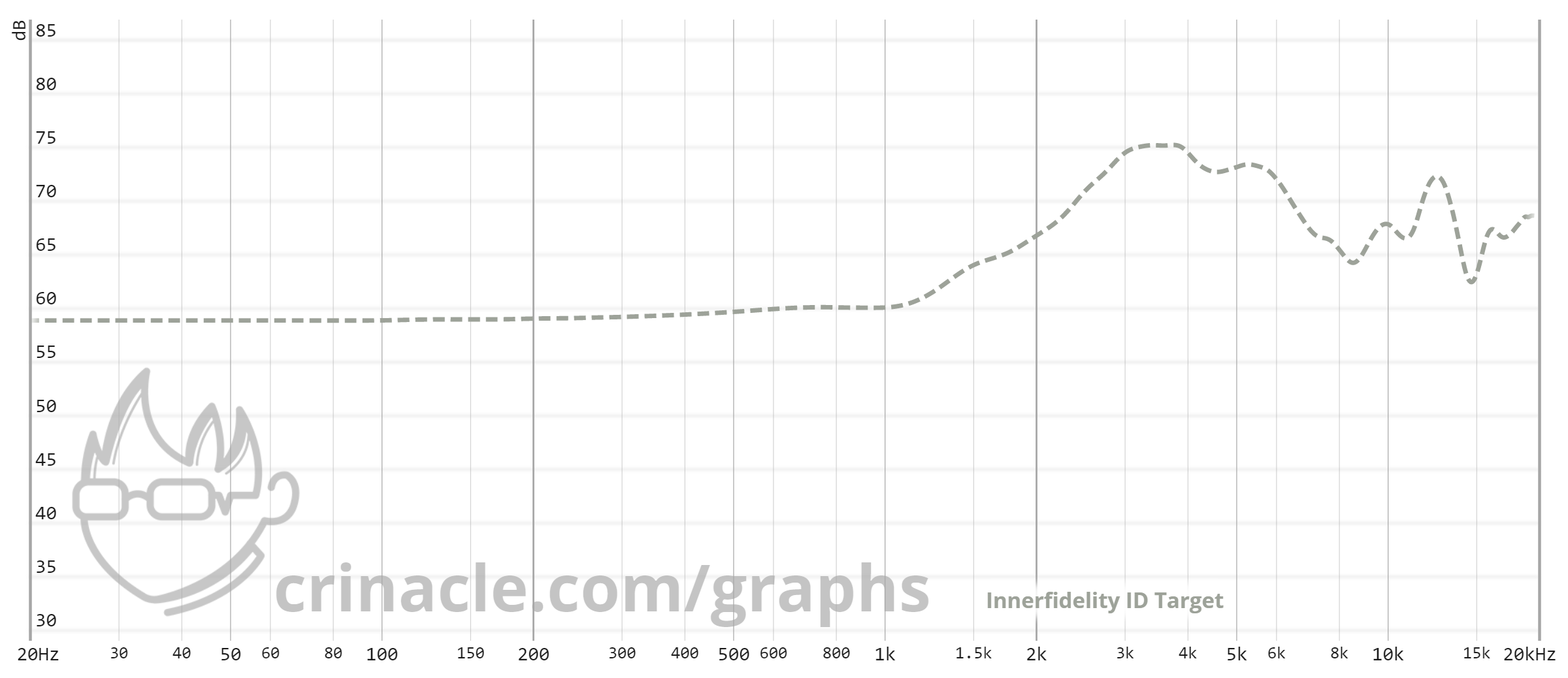
This is the reason why I’ve provided multiple target curves on my Graph Comparison Tool so that users have the freedom of choice to decide what compensation they’d like to use, as opposed to defaulting to DF all the time. And for those without premium access, here are the targets in question:
You can see that regardless of target curve, there is always an emphasis centering around 3kHz. The reason for this is explained in the next topic, and this is commonly referred to as “pinna gain” (in the context of IEMs) and “head gain” (in the context of headphones) in reference to the immediate body part that each transducer bypasses.
So just as a demonstration, what happens when you use the “Baseline” function of the graph tool to compensate the Etymotic ER4S raw graph using the Etymotic target?
The idea of compensation is not necessarily to turn “flat on a graph” into “flat in real life”, but rather to use certain target curves as reference points. For some people, due to the ubiquity of DF-compensated measurements, that’s what they’re used to and so raw graphs freak them out.
At the end of the day, use what you’re familiar with. But be aware that a compensated graph is not necssarily superior to a raw one, especially when the parameters are unknown. With raw graphs, the only variable you need to find out is the measuring system used, whereas with a compensated graph you’d need to find out both the measuring system and compensation used.
Speaking of measuring systems…
Measuring Systems
The wild and whacky world of microphones and mannequins
For headphone and IEM measurements, we need to simulate the human body (or at the very least, parts of it).
To understand why simulation is required, we have to look at how exactly the human body interacts with sound. Sound goes through a lot of physical mediums before it finally arrives at our eardrums. The head, the torso, the outer ear structure and the ear canal, all contribute to small changes to sound waves that can alter what would have been a flat signal to something totally different.
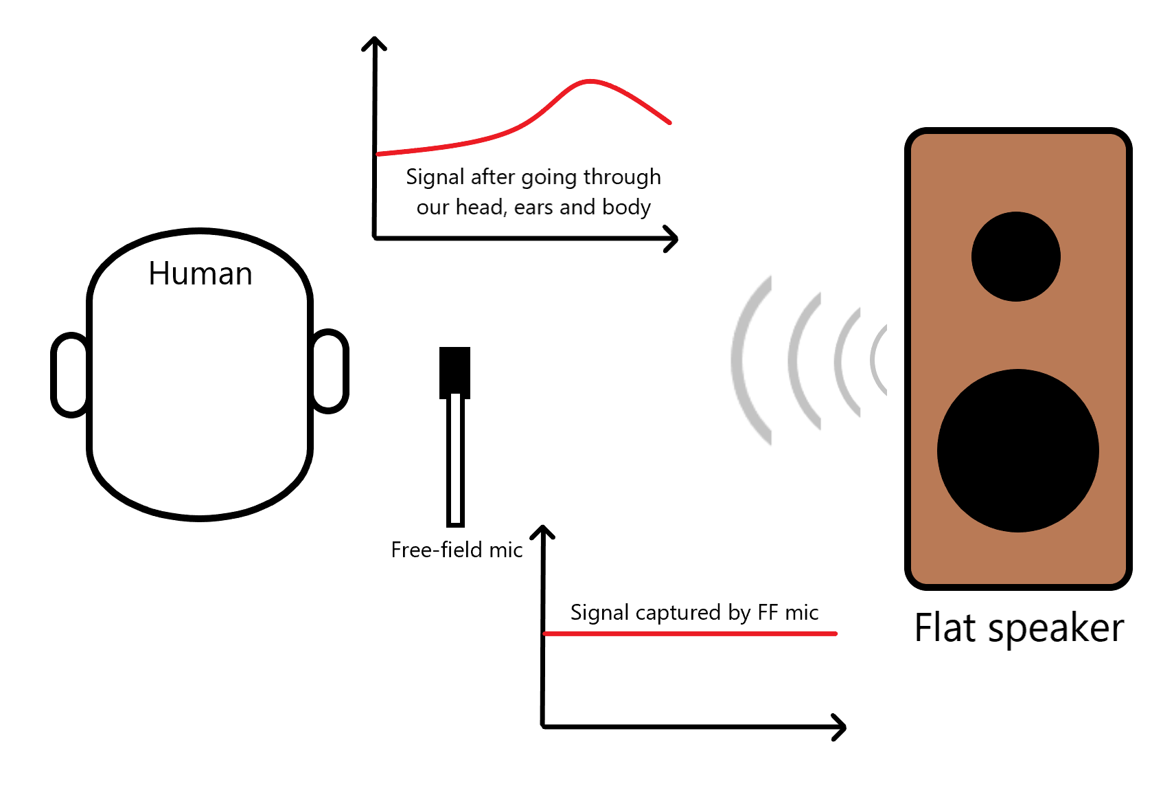
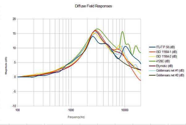
Using these Head and Torso Simulators (HATS) are how the above target curves are generated. And by selectively removing certain components on the HATS system, we can also find out what each body part does to the audio signal:
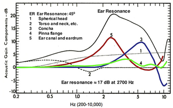
This results in the aforementioned pinna/head gain from the previous topic, and the reason why you don’t want a raw graph to be completely flat.
But simulating the whole body is only relevant when trying to find out how the human body interacts with sound in open air, as is the case with curves such as Diffuse Field and Free Field. In the case of headphone and IEM measurements, only the body parts that directly interact with the transducer are required.
For headphones, that will be:
- The flesh and bone surrounding the ear (that comes in contact with the pads)
- The outer ear structure
- The space between the outer ear and eardrum (which includes the ear canal)
Whereas in IEMs, only the last part is required for measurements since they bypass the head and pinna flange.
IEM Measuring Systems
For IEMs, measurement systems can be categorised into two general types: occluded-ear simulated or without occluded-ear simulation.
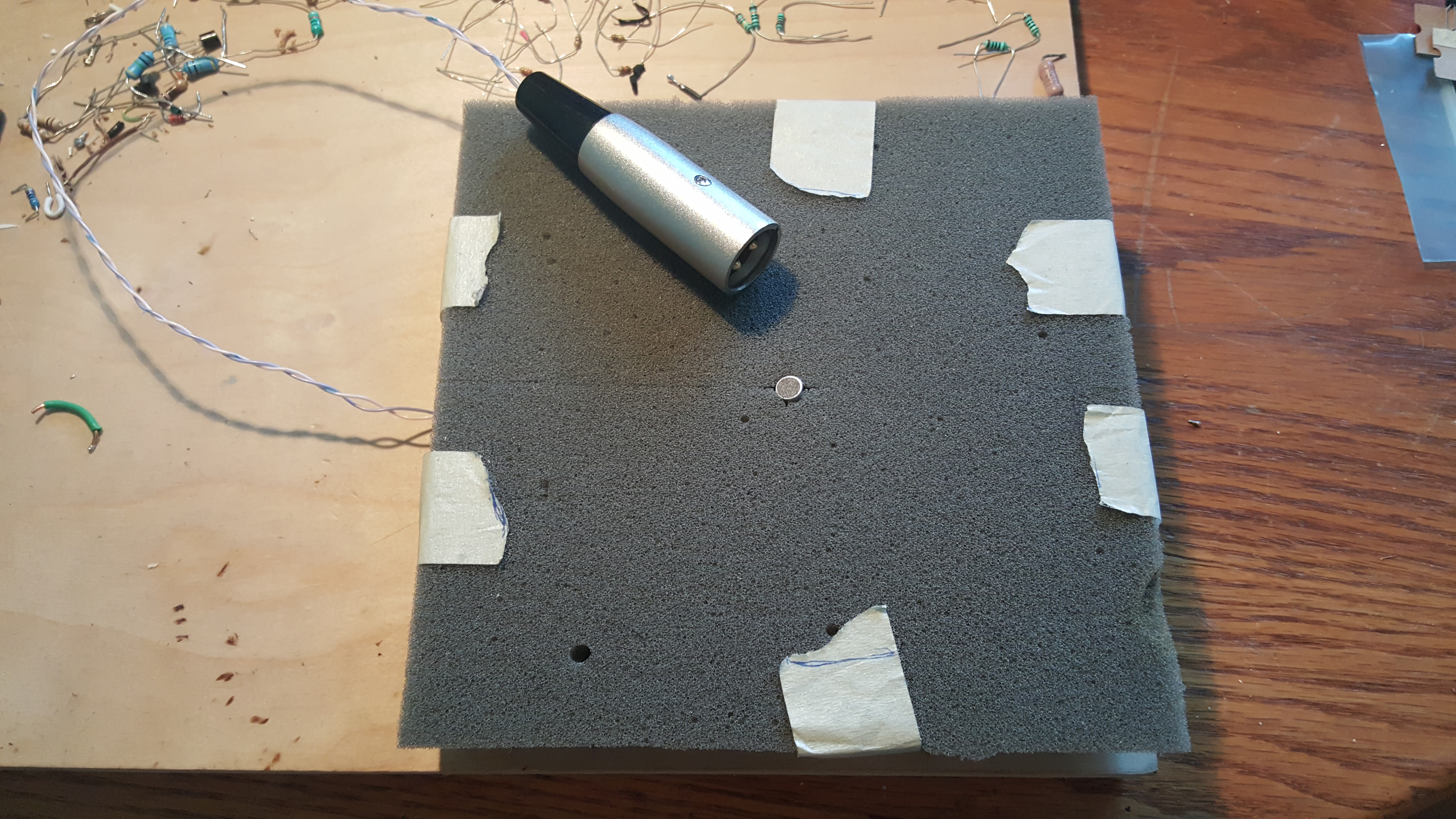
Couplers that do not have this occluded-ear simulation include things like the Vibro Labs Veritas (now defunct) and my old Dayton iMM-6 rig that uses vinyl tubing as a makeshift coupler. These couplers largely consist of sealed DIY rigs and are more than adequate for internal comparative purposes (i.e. graphs made using the same coupler and system) but cannot be compared with academic target curves due to the different coupler used.
On the other hand, IEC60318-4 is the magic string of words and numbers that represent the “industry standard” for occluded-ear simulation. The previous standard was known as IEC60711, so that’s why some people also refer to IEC60318-4 systems as simply “711 couplers”. My database is built on an IEC60318-4 compliant coupler, hence why it can be compensated to academic curves that were also built on the same standard.
But even within the “occluded-ear simulated” category, there lies new competing “standards”: the GRAS RA040X and the B&K Type 4620 (5128). The main draw of the RA040X is its dampening of coupler resonance which allows for easier interpretation of FR graphs generated from such systems. This will be explained further in the next topic.
That’s not all, the difference in measurement rigs get even worse when you put headphones into the mix…
Headphone Measuring Systems
Just like with IEMs, headphone measuring rigs can be essentially classified to two broad categories of simulated versus non-simulated. And unlike IEMs, the costs of simulating the required body parts for headphone measurements are prohibitively expensive, and so majority of the graphs that you can find online would be done on simple non-simulated DIY rigs.
The most common DIY headphone measuring rig is known as the “flat plate”, where the headphone rests on a literal flat plate with the microphone flush against the plane:
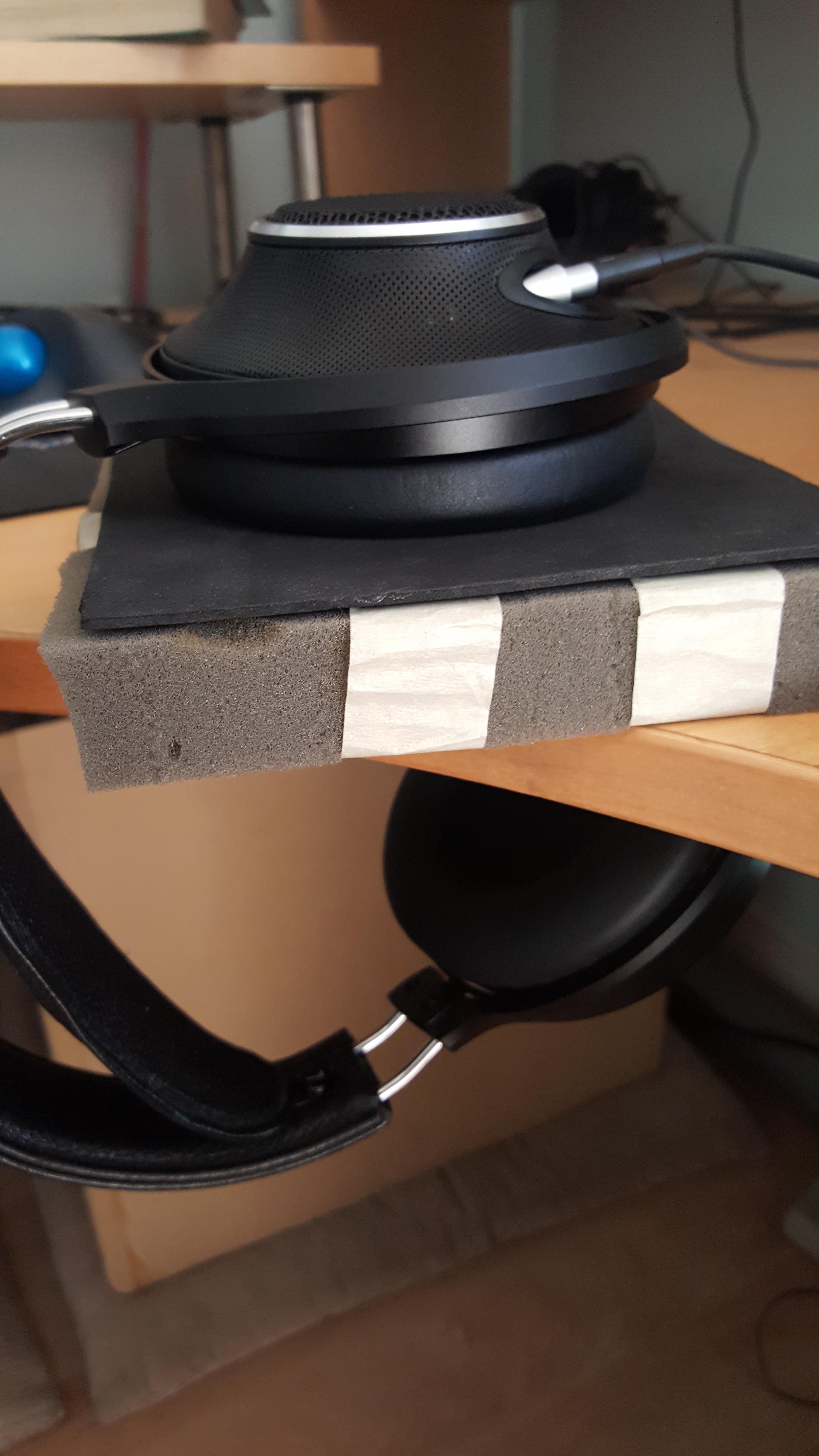
Credit: OJneg, SBAF
The other category, simulated, is a broader category as some rigs don’t have all the required simulators for a fully accurate measurement. The miniDSP EARS, probably the only commercially available plug-and-play headphone measuring rig right now, has a pinna simulator but no occluded-ear simulator. Its pinna doesn’t follow any standard, but hey, it exists.
The difference in pinna structure, coupled with the odd canal and lack of occluded-ear simulation results in a response that’s quite different from industry-standard gear:

And even when we move into the realm of industry-standard equipment from companies like GRAS and B&K, we face a different kind of inconsistency. While the occluded-ear simulator is relatively well-defined under IEC60318-4, pinna simulators tend to differ from manufacturer to manufacturer:
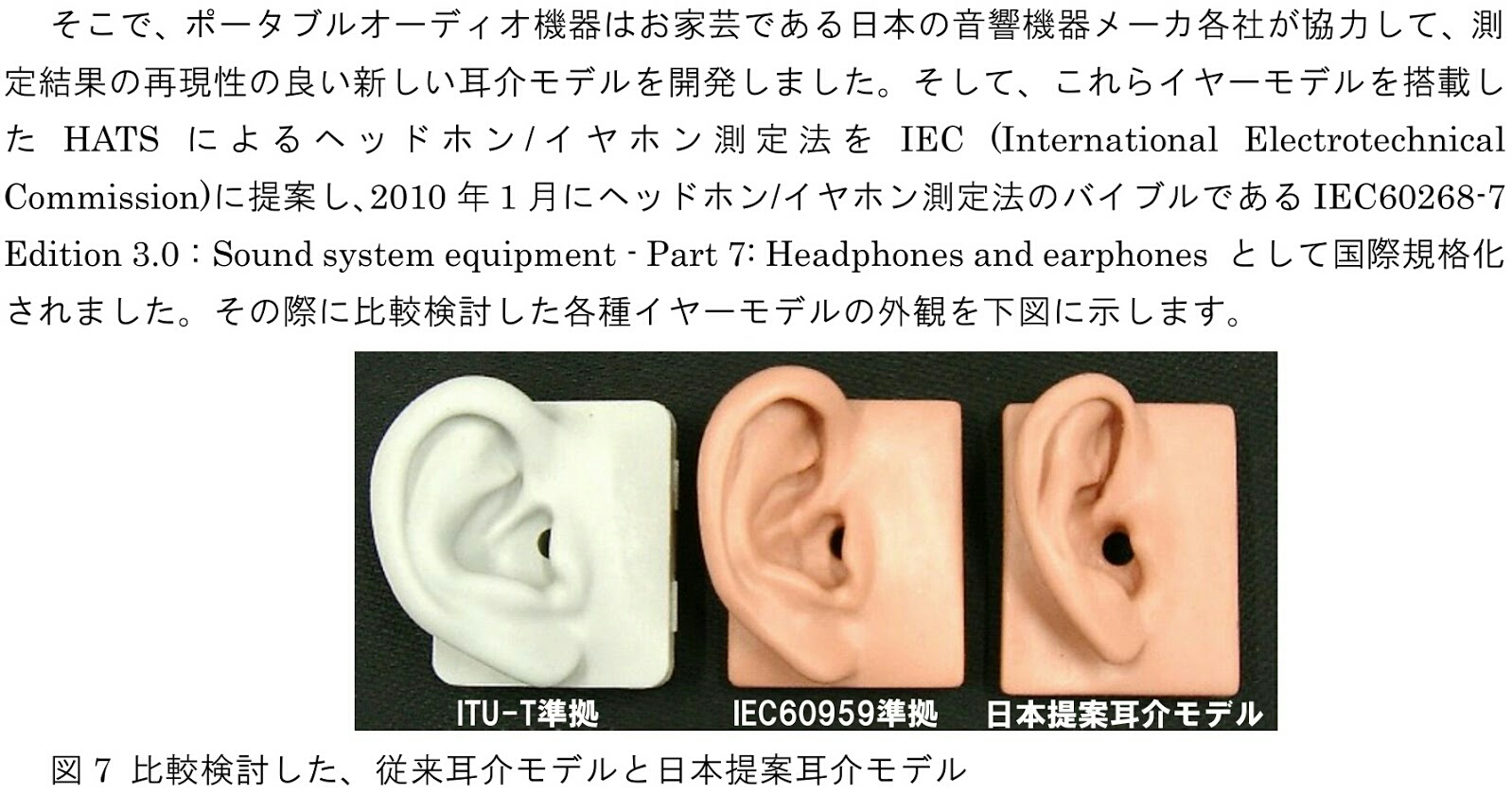
Source: Clarityfidelity
So even between rigs that have proper occluded-ear and pinna simulation, the differences in final measurements can be quite significant:
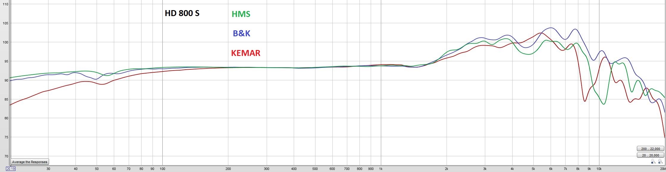
For headphone measurements moreso than IEMs, cross-referencing between different rigs is highly discouraged. The best way to compare headphone graphs is internally: same rig, same methodology. Consistency and repeatability is key in the world of measurements.
Why know this? In order to proper read a FR graph, you have to know its source. A subpar looking graph on an unproven DIY rig could look pretty good compared to when the same headphone/IEM is measured on an industry-standard one, and vice versa applies. Knowing the measurement system used is half the battle in reading FR graphs, and it pains me to see how little the question “what are you measuring this on?” is asked even in data-obsessed objectivist ciricles.
And of course, Brüel & Kjær is soon releasing their new Type 5128 that comes with a lot of new changes that promises better accuracy and precision, but you know what they say…
Coupler Resonance
That scary peak nobody likes to see
This part is more in reference to IEM measurements moreso than headphones, though it’s still relevant in the latter.
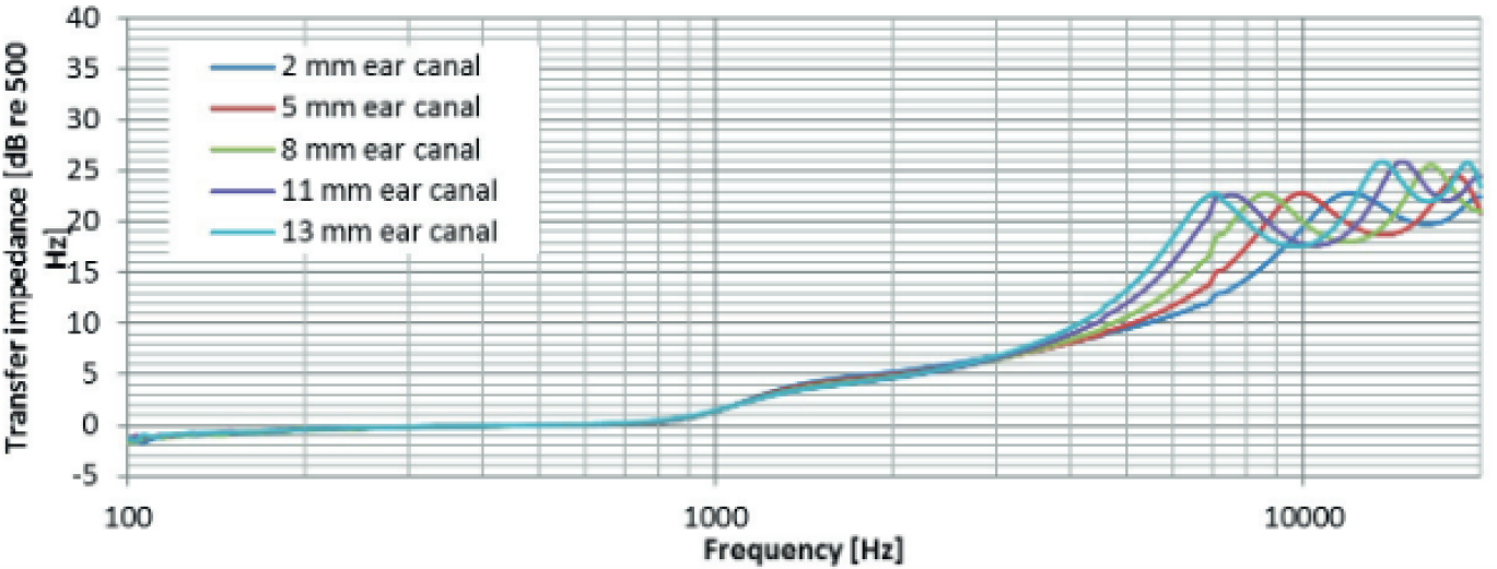
Now since our ear canals (and in turn, the equipment that simulate it) are essentially hollow tubes, that means that sound waves going through it will result in half-wave resonances. Again, the exact mechanics of this requires a whole physics lesson by itself, so here’s the simplified TL;DR: when measuring IEMs, there will always be a consistent, repeatable “spike” in the higher frequencies. This “spike” is known as coupler resonance and is typically a constant that’s independent from the IEM being measured (assuming consistent methodology).
This resonance can be controlled with a consistent measurement methodology in which the insertion depth of the IEM into the canal is made constant. For my measurements, I have this resonance normalised at 8kHz (whenever possible).
Note that:
- Consistency and repeatability takes priority. The location of the resonance bears no immediate significance, only that the measurer (me) is able to hit it consistently.
- Deviations from the targetted resonance is expected since different IEMs have different fit. Universal IEMs like FitEar demo units and 64 Audio universals tend to have short and stubby nozzles, hence resulting in shallower inserts.
- These concepts of resonance is in the assumption that the coupler is undamped (more on that later).
To demonstrate my point, I’ll randomly pick and choose a few IEMs from my graph database:

As you can see, due to my measurement process there will always be a consistent, repeatable spike at around 8kHz. Keeping the insert depth constant (and so the resonance point) ensures that graph readers can immediately identify what peaks are due to half-wave resonances and what are inherently from the driver itself.
Adjusting the insertion depth results in the half-wave resonance shifting up or down the frequency spectrum. The effects are as follows:
A shallower insert causes the resonance to decrease in frequency. A deeper insert causes the resonance to increase in frequency.
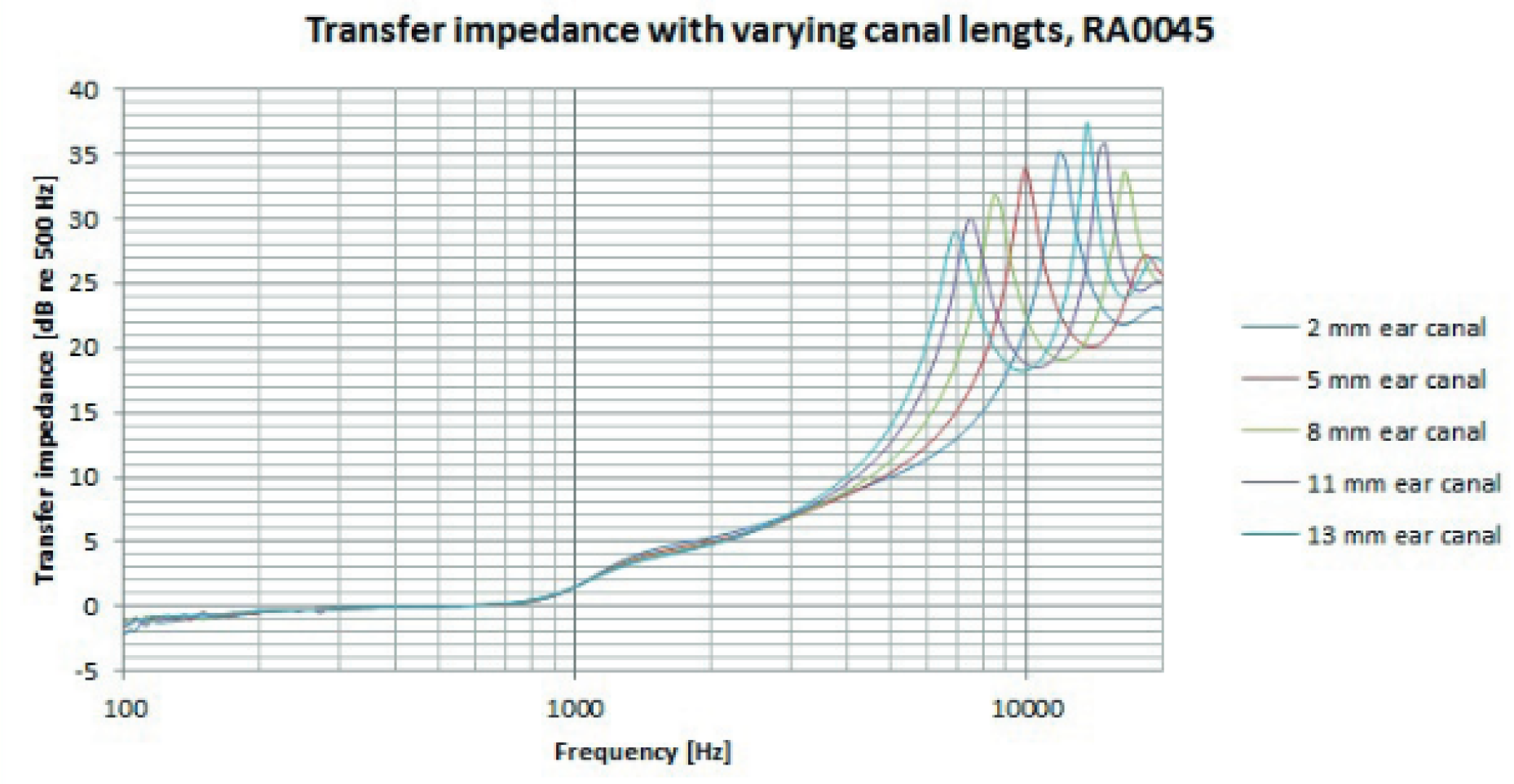
And to prove my point how insertion depth (and its inconsistency) can completely marr a database’s reliability, I’ve performed my own insertion depth test with the IER-Z1R. Same IEM, same method, different insertions.
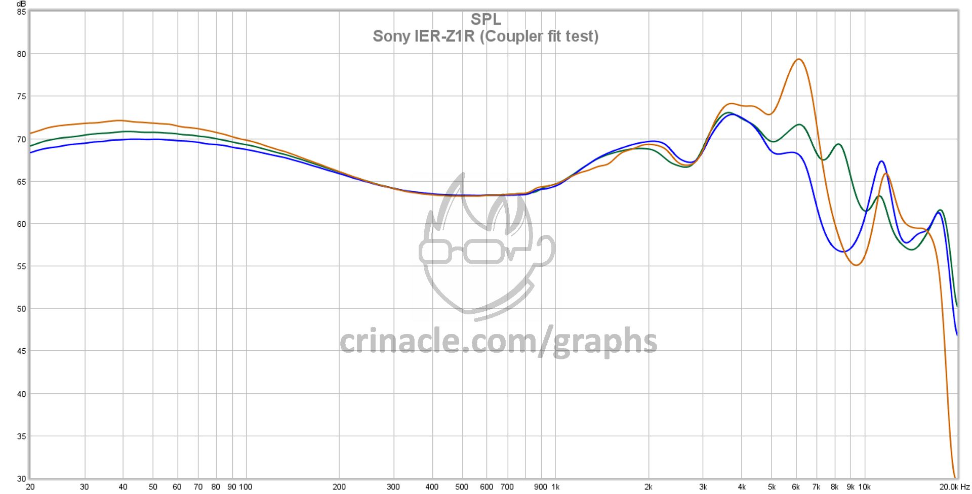
This is the same IEM, yet the measurements look completely different! A shallow insert results in a painfully large 6kHz spike, while a “reference plane” insert (AKA deep insert) causes the SPL between 6kHz and 10kHz to drop significantly.
In the case of the shallow insert, the sharp increase in SPL is due to the fact that coupler resonance has its own “Q-factor” that also affects the frequencies surrounding it. A shallow insert also tends to increase the magnitude of the resonance along with decreasing its frequency, so a lot of frequencies immediately below said resonance are also subsequently boosted as well.
As for a deep insert, the magnitude of the resonance decreases along with increasing its frequency. For many IEMs, a deep insert is an easy way to tame treble but in the context of IEM measurements, it also tends to “valley” the range at and around 8kHz.
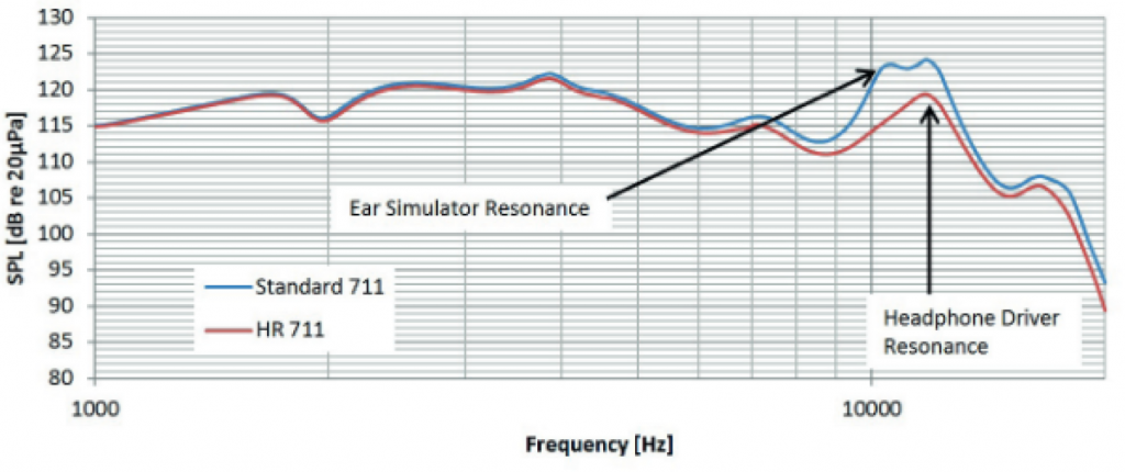
Now, imagine if a database does not have its testing methodology laid out. You would have no idea where their resonance point is and would have to guess whether a particular peak is due to coupler resonance or if it exists inherently as part of the driver. This is a problem that many enthusiasts face, a problem that GRAS attempts to address with its “high resolution” IEC60318-4 coupler that is built specifically to target and dampen coupler resonance:
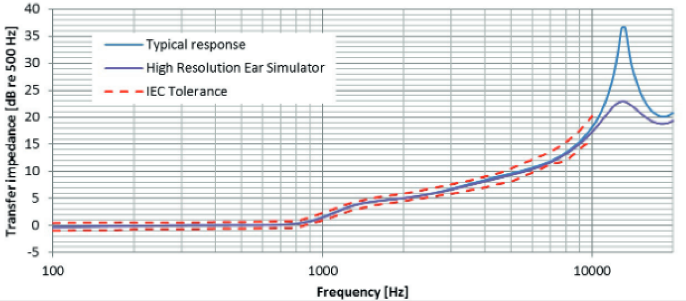
Which means that insertion depth and resulting resonances are not as significant as on other IEC60318-4 couplers:
The main draw of such is a coupler is to separate “coupler resonance” from “driver resonance”, making graphs far easier to interpret for the layperson:
However, there have been debates on whether or not such intentional dampening of resonance peaks are truly representative of what we hear, and if GRAS is sacrificing accuracy for readability. The Sony MDR-Z1R debacle is such a case, in which the existence of a 10kHz spike in the headphone was hotly contested between Head-Fi’s Jude Mansilla and Innerfidelity’s Tyll Herstens. It’s a debate that’s probably too deep for a “basic” guide such as this, but it definitely deserves a mention due to its relevance in this topic.
Harmonics
Why higher frequencies matter more than you think
Harmonics are also known as “overtones”. They are the frequencies that gives an instruments its timbre, though in the audiophile circles the term “tonality” is used to describe how natural or coloured a transducer is.
So why is it that the term “tonality” and sometimes “timbre” is commonly discussed in the same page as frequency response? Before we delve into that, we’ll have to define what exactly “harmonics” are.
Music and instruments, as you all may know, are not pure tones. The sine sweep that you may have listened to at the start, now that’s a pure tone. A cold, unfeeling tone that represents absolutely nothing but the singular frequency it is playing. Harmonics on the other hand, are multiples of a fundamental tone.
So if your fundamental frequency is 1kHz, your second harmonic would be 2kHz, your third harmonic would be 3kHz, so on and so forth. Let’s refer back to frequency chart of the first topic:
On each instrument, you can see the graphic separating it to orange and yellow. The orange represents the range of the the fundamental frequencies that instrument is known to play, and the yellow represents the harmonics that said instruments is known to generate.
The fundamental frequency is tied to the note that is being played, for instance middle C (C4) has a fundamental of 261Hz, A4 has a fundamental of 440Hz, A5 has a fundamental of 880Hz and so on. This is also assuming a classical tweleve-tone equal temperment, but that’s a whole different topic on its own. A full list of key frequencies are available on Wikipedia.
So when we play a C4 note on a trumpet, the spray of harmonics could look like this:
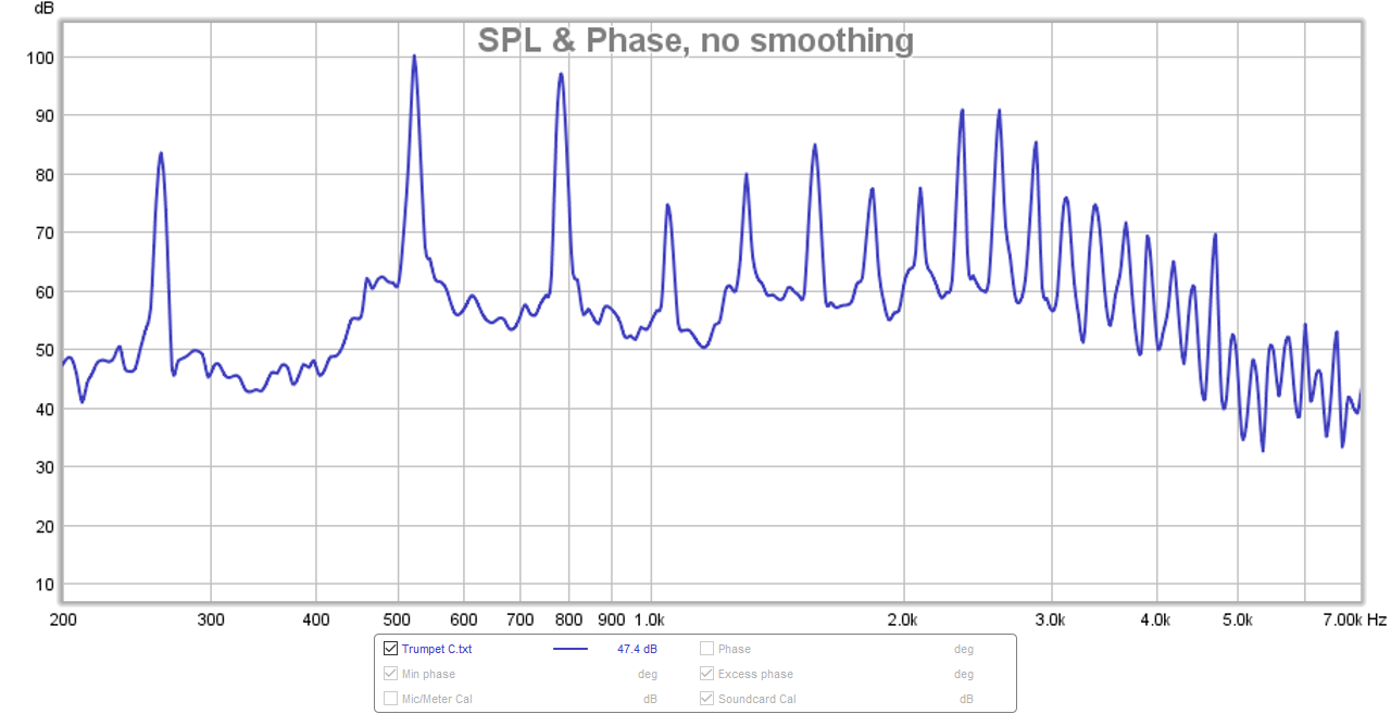
And as you can see, each “spike” is a multiple of the fundamental of 261Hz (C4), so the second harmonic is placed at 522Hz, the third at 783Hz and so on.
Still with me? Good.
So how does harmonics relate back to frequency response? It’s simple really: the frequency response shows the pattern in which the headphone will play back harmonics.
Let’s take two IEMs that are very different FR-wise, and play a C4 trumpet note. I’ve selected the Sony IER-Z1R and the recently reviewed Anthem Five E2 for this demonstration:
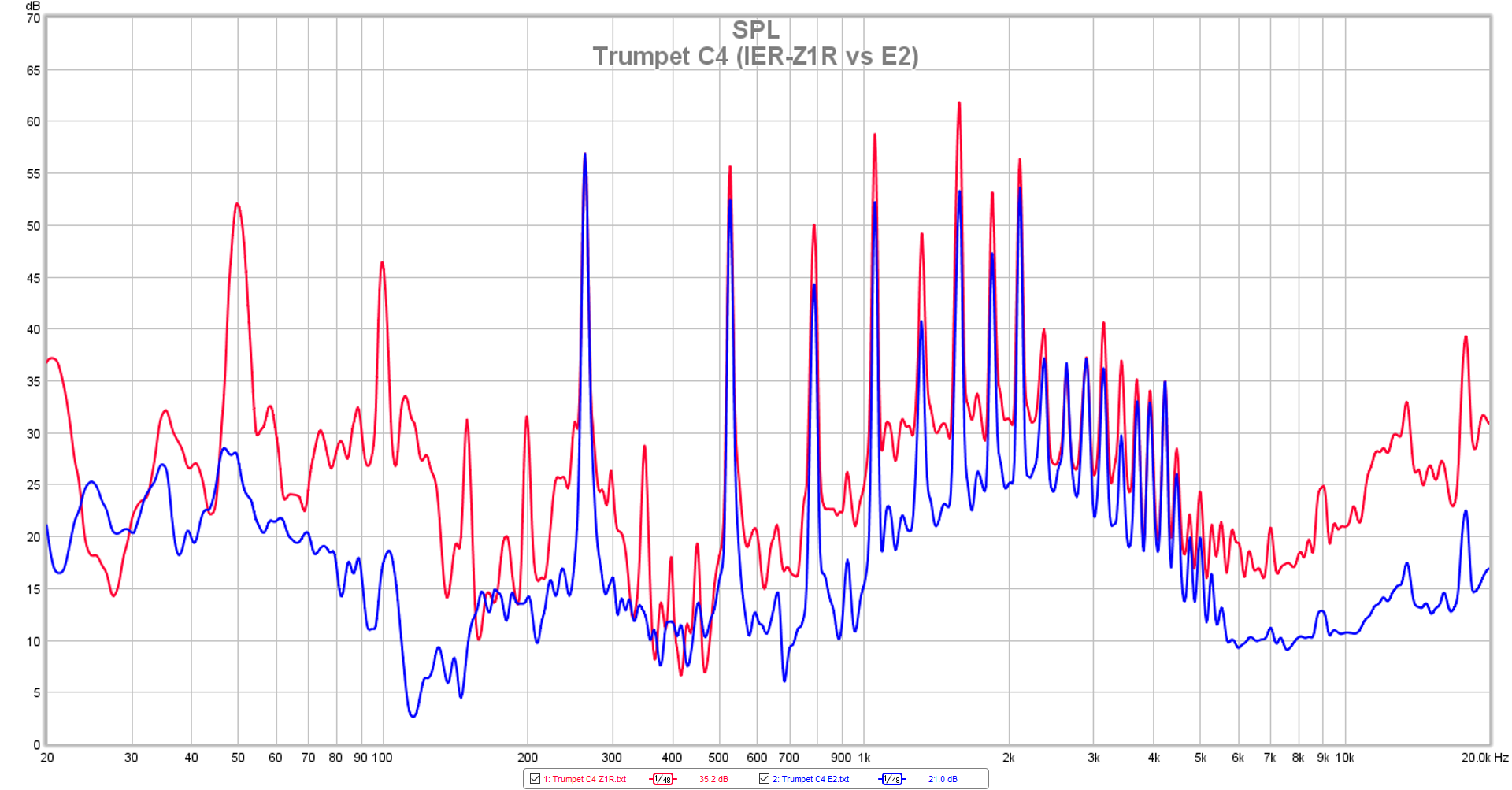
You can see that while the general trend of harmonics is largely the same, there are slight differences in magnitude at each harmonic. And of course there would be, after all, nobody would argue against the fact that the IER-Z1R and the E2 sound different from each other.
But how would you predict this purely from FR? A simple overlay would tell you everything:

You can see the difference in each harmonic correlates with the each IEM’s frequency response. I’ve normalised everything at the second harmonic of 522Hz which is why both the FR graphs and the second harmonics are matched to each other.
- The fundamental of 261Hz is higher on the E2 than it is on the Z1R, which is confirmed on the FR comparison.
- The third, fourth, fifth, sixth, seventh harmonic is lower on the E2, also confirmed on FR
- The tenth and eleventh harmonic is higher on the E2, confirmed on FR
- The Z1R has higher harmonics from the twentieth harmonic onwards, confirmed on FR
I’ve skipped a few in-betweens but you get where I’m coming from. Harmonics, tonality and timbre are concepts that are very much interwined with frequency response. You can get a fairly good idea of a headphone’s tonality through FR measurements, provided that you know how to read and intepret them in the first place.
The Importance of FR
It's only useless if you don't know how to read them
No more lessons, this is just a short afterword.
At the end of the day, an FR measurement is only as useful as the person interpeting it. I’ve seen figures being thrown around regarding how significant graphs are in the hobby, and once we ignore the outliers (i.e. those who call them completely useless or the ones who say that FR tells us everything objectively), the amount of different answers that I see are plentiful… and expected.
Again, an FR measurement is only as useful as the person interpeting it. Only those who choose to learn are afforded the knowledge. A graph does not automatically bestow upon you the hidden secrets of a headphone; one requires a certain level of critical thinking in order to reap the full benefits.
I’ll be back to my regularly scheduled (ha!) product reviews after this. This has been one of the most in-depth guides I’ve written thus far, and I hope you found it useful.
Support me on Patreon to get access to tentative ranks, the exclusive “Clubhouse” Discord server and/or access to the Premium Graph Comparison Tool! My usual thanks to all my current supporters and shoutouts to my big money boys:
“McMadface”
“Desertscrub”
“Galactus”
Will
Kurt
Man Ho
Denis
Nicholas
Alexander
Andrew
Ted
chisquare
Rene
“Brbi2kCRO”

12 thoughts on “Graphs 101: How to Read Headphone Measurements”
great read! I would like to see differences in FR measured using GR040X and GR0045 couplers
Your measurements of the Stax L300 seem to show very good extension into the sub bass. It’s strange since all other measurements I have seen show that it falls off below 100hz. Is this a measuring error?
An imperfect seal with Stax will result in a mild midbass boost followed by extreme sub-bass rolloff, which is why L300s are often modded to tighten said seal. Any Harman-style target compensation will also make measured-flat bass look rolled off, reflecting the fact that most people perceive boosted bass in both headphones and IEMs as subjectively neutral.
Thank you, very impressive and useful reading!
Great article! Very explanatory.
I miss a bit you don’t talk about the “Harman target” that for me is is the real “flat” target and the guide to select the iems I like to buy and enjoy.
I miss to a little explanation about all people have a natural and favourite “sound signature” (warm, neutral, cold, etc) and how it influences our opinions about one headphone/iem or another. And explains how different people may have som very opposite thoughs about the same headphone/iem.
I know that for you this article is important to set your fundamentals and statements and people knows why you reviews are the way they are. Thanks mate I really apreciate it.
Stay safe!
There is nothing like having clear ideas to be able to express them clearly. This you have certainly achieved in this article and I’m very grateful to have received the tools that will help me to interpret the FR graphs (or, at least, give me the illusion that I can).
Thanks!
I have learned a lot through this writing. Thanks a lot, Crin.
Great article! Thank you very much!
This comment has been posted in both of the articles mentioned below.
Suggestion for collaboration database.
Hello Crinacle and Acoustics Insider,
I have been working for 14 years in professional music studios, and recently started working with headphones for private productions.
There is a great debate in the world of music Mastering and Mixing about ” What is Flat? ” and ” What is actually Reference! ”
You both have written the best articles I have read (and I read a lot) that address the question of a reference sound in modern perspective.
____
An Inconvenient Truth About Room Acoustics (The Myth Of The Flat Frequency Response)
https://www.acousticsinsider.com/flat-frequency-response/
Graphs 101: How to Read Headphone Measurements
*See: Compensations – And the concept of “target curves”
https://crinacle.com/2020/04/08/graphs-101-how-to-read-headphone-measurements/
____
The fact is that many high-end >$200,000 Mastering Studios have less of a “Flat” frequency response than some $300 In-Ears these days.
I believe that by comparing your measurements of actual professional studios and headphones, we can have better understanding of which headphones are reference ready for music production, than what is currently known and published.
Just imagine if this information would be available and comparable 🙂
I believe this comparison will be incredibly valuable for every music producer and engineer!
And will widen and enrich the idea of the reference concept.
*This could be a an impressive alternative to products like Waves Abbey Road Studio (only their frequency response)
*Crinacle imagine using a famous music studio as ‘Baseline’ function in the graphs
Thank you and good luck!
I think imaging is measurable by measuring Weighted Group Delay, Weighted Phase Mismatch, Weighted Amplitude Mismatch, and Weighted Frequency Mismatch like on Rtings.
Thanks for this article, I found this a very good introduction to some interesting concepts that I didn’t know before, and that I can now explore more deeply by myself.
An excellent article, Crinacle .. but an important factor you (and nearly everyone else) misses out, is the effect of ‘clamping pressure’.
When I was involved in headphone design (previous century), this was a huge debate in the R&D Dept. Changing the ‘clamping pressure’ on ‘open ear’ models like the Sennheisers will move the whole frequency range below 1kHz up & down by 5dB
This is easily demonstrated in real life on music
The old KOSS Pro 4AA (IIRC) had the best LF of any headphones at the time for many reasons but one was its very high ‘clamping pressure’.
The effect is also apparent with IEMs but less easy to use.